170+ LSAT Prep Course
UI/UX + Visual Design + Web

Project Overview
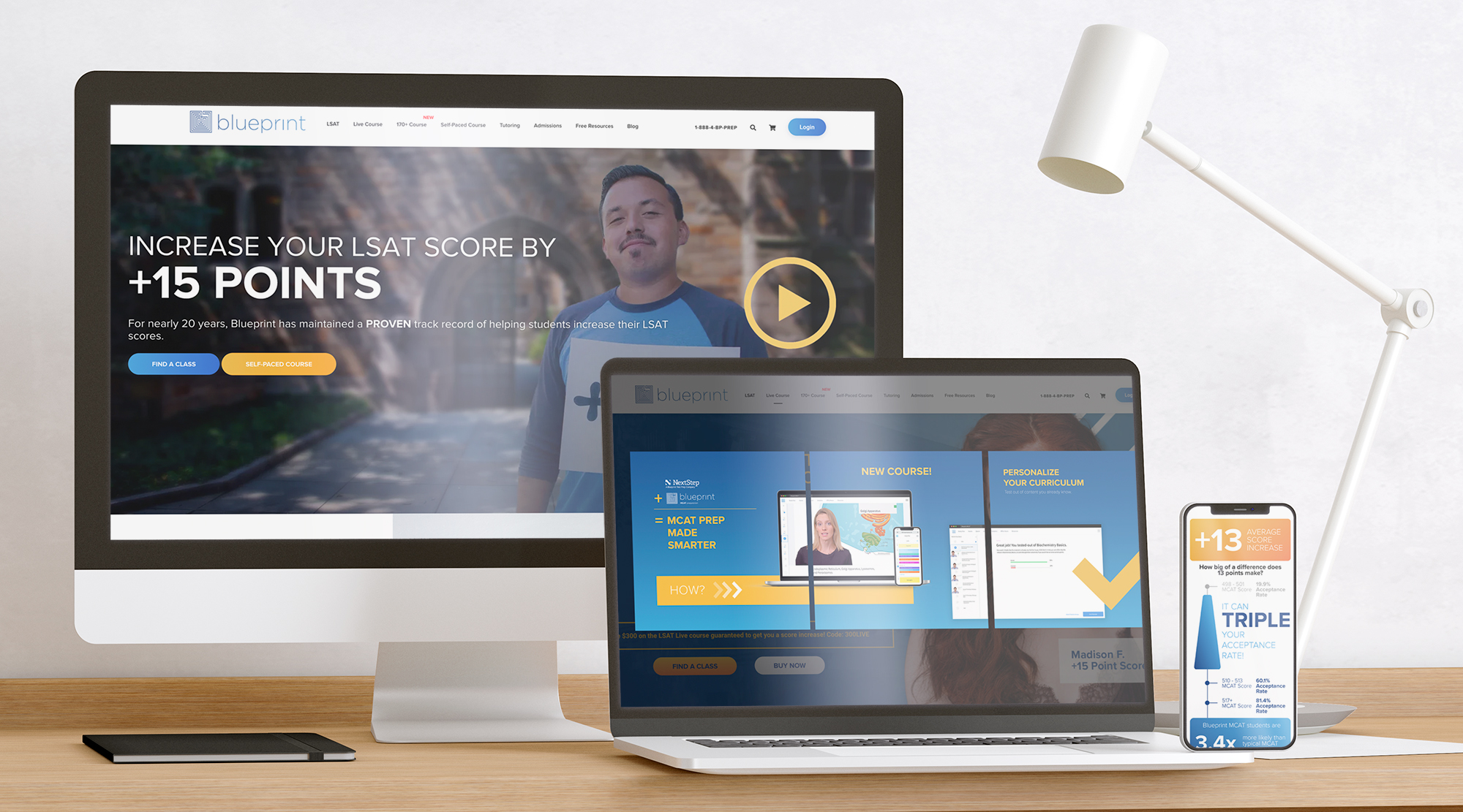
Blueprint Test Prep provides learning materials and tutoring for people intending to take the LSAT or MCAT test (for admission to law school and med school respectively). The 170+ Course page is a product page for a more premium offering that guarantees a score of 170 or higher.
Constraints
- 4 week timeline
- Fit existing Magento framework
My Contributions
- UX & UI Design
- Visual Design
Technologies Used
- Adobe Photoshop
- Adobe Illustrator
- Figma
- Hotjar
- Google Analytics
Process


Research
Because of the tight turnaround and the fact that pages of this type & purpose already existed, existing research on the other pages in this category was used instead of new research. Available data sources were google analytics, heatmaps, and focus groups of these existing pages.
Analytics & Heatmaps
We tracked the performance of web pages using Hotjar and Google Analytics. Key takeaways included:- "Learn More" and "Buy Now" CTAs are frequently Used
- Users visit multiple times before buying; typically on a third or fourth touch they will go straight to the buy button.
- While heatmaps and time-on-page stats show that very few users scroll to the bottom of the page, experiments with shortening the page reduced conversion rates.
- The heatmap also indicated that users interacted heavily with expandable content sections, showing that users were invested in consuming content on a detailed level.
- The two above points suggest (and focus groups later confirmed) that the presence of content increased users' confidence in the product, even if they didn't necessarily consume it all
Focus Groups
Focus groups were composed of both students who had already purchased some version of the product and groups in our target demographics who were assembled by a third party. They were observed navigating the site and asked about what might improve their chance to buy and their overal limpression of the company.Users' key desires included:- More images of the actual product, as opposed to students/testimonials
- See more instructors
- Clarify exactly what is included in each package

Ideate & Prototype
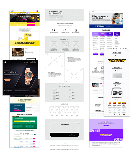
To address the requirement of a premium look and feel, I created a moodboard with examples of pages for premium offerings from both competitors and unrelated companies in order to avoid getting stuck in a certain system. While this moodboard would come into play more in the visual design (which is not the focus of this case stu, looking at various layouts and information heirarchies did inform the wireframing and help differentiate the structure from existing product pages.
Test & Deliver
While ideally of course testing is performed at the wireframe stage, the fast turnaround on this project necessitated testing internally and making sure the content matched the business requirements before launching quickly.
The modus operandi at this company was to deploy quickly and measure real users' behavior and make adjustments on the fly, so I continued to work closely with the web deployment team to make adjustments and additions as needed.
