IdentityMind Global Rebrand
Branding / Corporate Site / Landing Pages / Print
- Led the complete brand and visual overhaul, working with one Jr. Designer.
- Drove process of brand value discovery and creation of brand story with buy-in from C-Suite and Board of Directors.
IdentityMind provides SaaS for financial companies to efficiently perform legally required compliance activities - mainly involving Anti-Money Laundering and Know your Customer (KYC) laws. In addition to the design, I led the process to create the brand story and values:
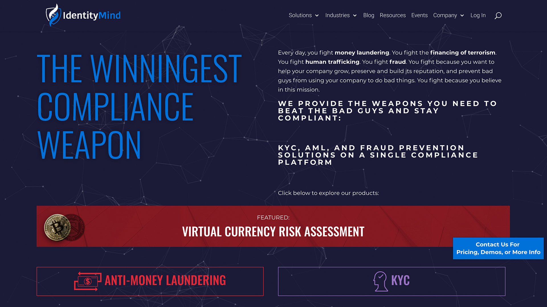
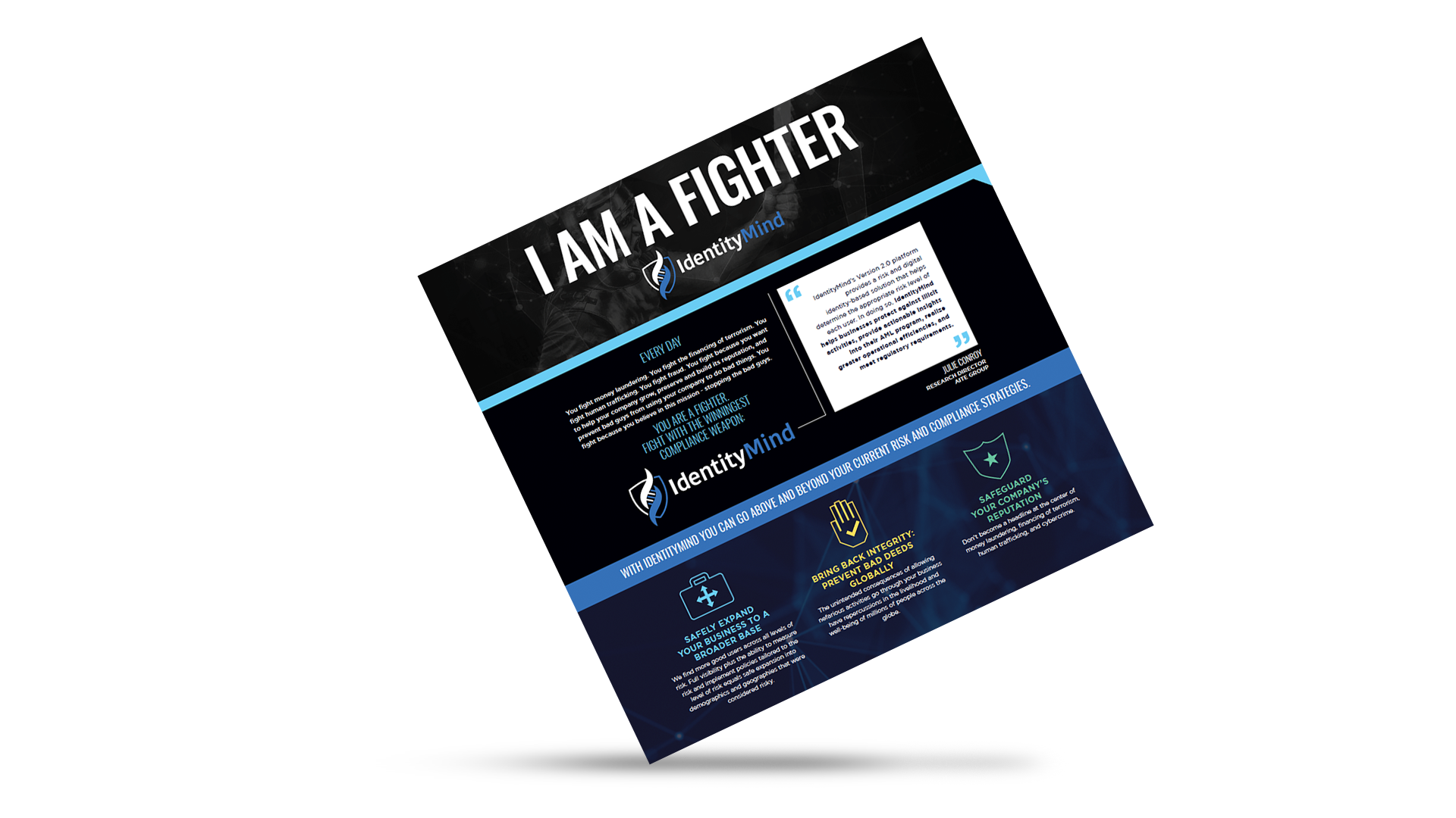
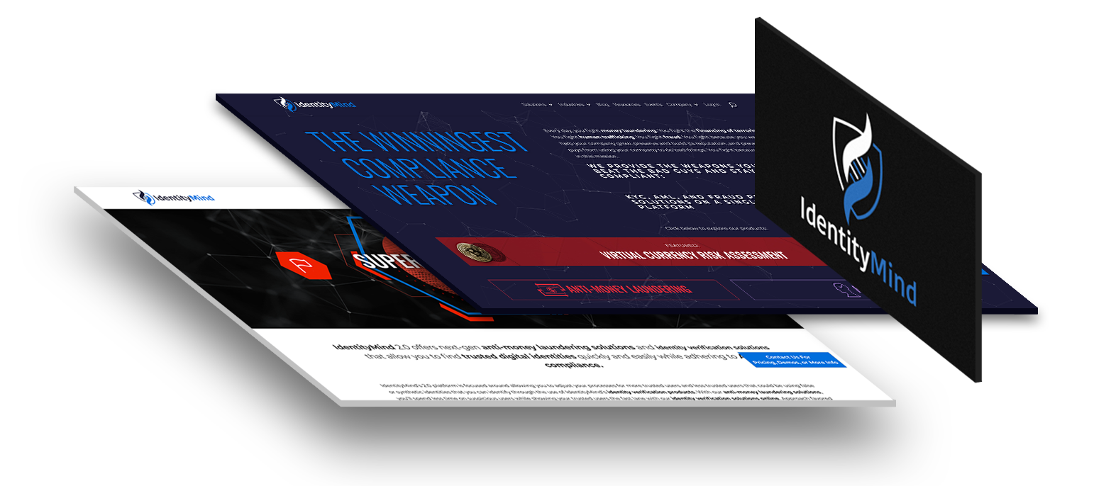
Every day, you fight money laundering. You fight the financing of terrorism. You fight human trafficking. You fight fraud. You fight because you want to help your company grow, preserve and build its reputation, and prevent bad guys
from using your company to do bad things. You fight because you believe in this mission.
WE PROVIDE THE WEAPONS YOU NEED TO BEAT THE BAD GUYS AND STAY COMPLIANT: KYC, AML, AND FRAUD PREVENTION SOLUTIONS ON A SINGLE COMPLIANCE PLATFORM
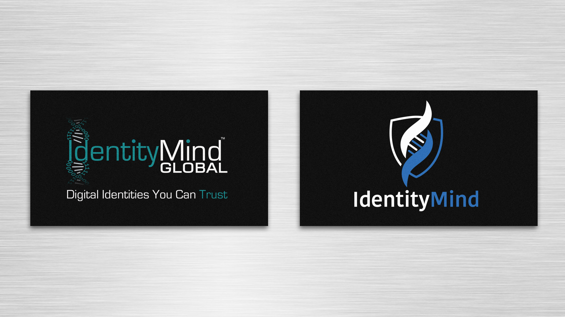
The issues with the original logo (left) included:
- Color: The mid-value turquoise works on white or black backgrounds, but not on any grey or irregular backgrounds.
- Dimensions: The height of the DNA strand made it difficult to display the logo at small sizes, and the tagline was not legible at small sizes.
- General: Draftsmanship on the DNA strand is poor, typeface and overall look is dated.
Additionally, the company was a start-up and a brand identity had never been established. This was exciting as I got to start from the ground up, and it the small size of the company allowed me to speak directly to founders and senior team members to get a truly deep understanding of the company's mission. This involved several meetings with the CEO and input from the board of directors.
We worked to connect the company's offering - anti-money laundering and financial regulation software - to find its social mission - preventing the financing of crimes like human trafficking, terrorism, and extortion. IdentityMind would be the customer's ally and defender against these acts. From here we began sketching visual elements associated with protection and trust.
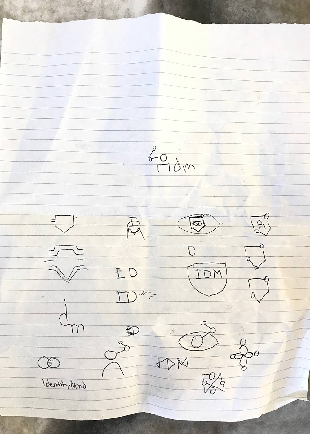
From those sketches we began exploring more fleshed out logo ideas. We originally tried to focus on the idea of an "identity" or "user," along with trying to convey the "interconnected" nature of our approach.
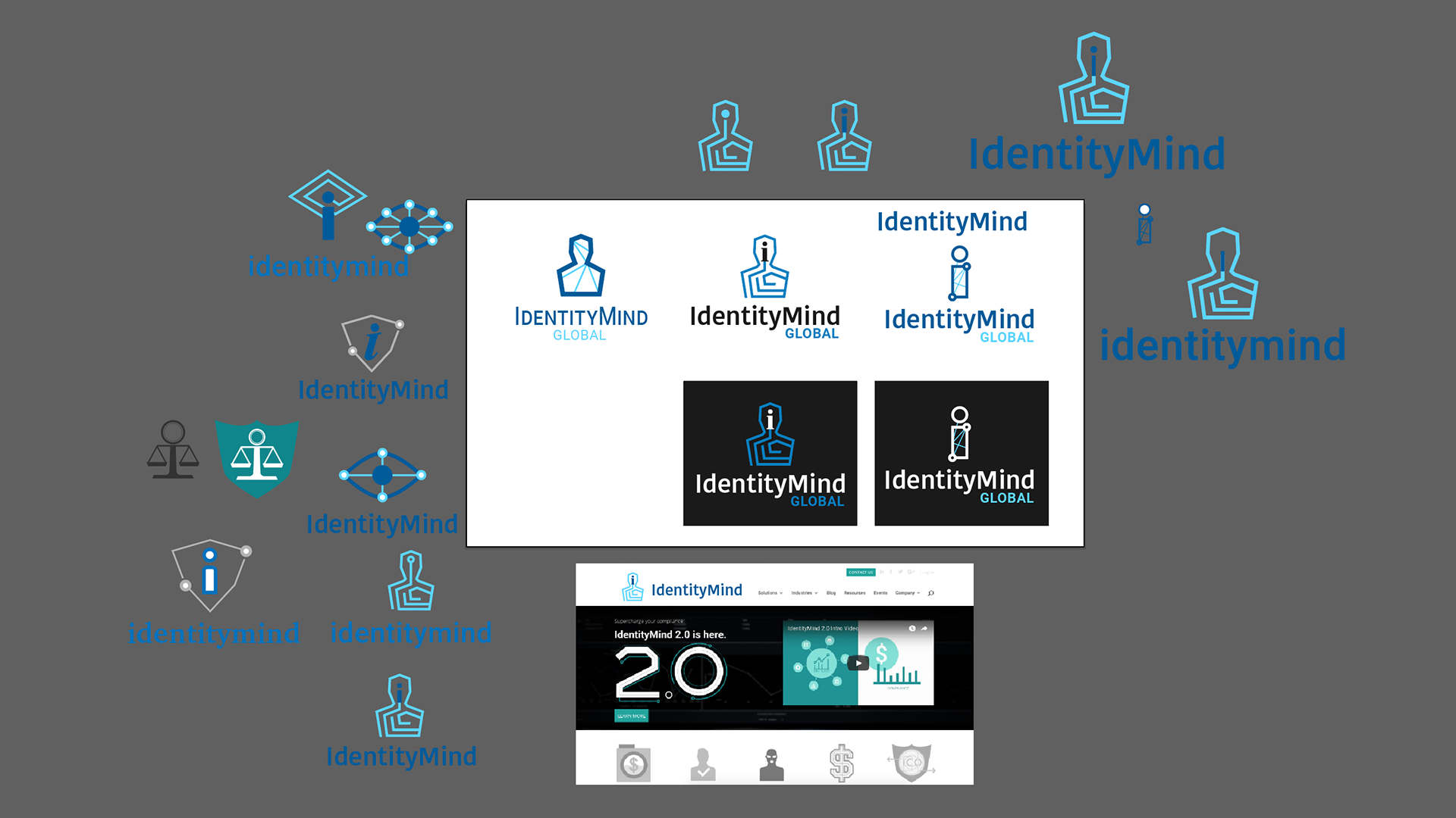
We quickly realized we were trying to say too many things and scaled back to focusing on the brand identity as a "defender" or "ally." You can see a first draft of the DNA Shield that would become the final logo.
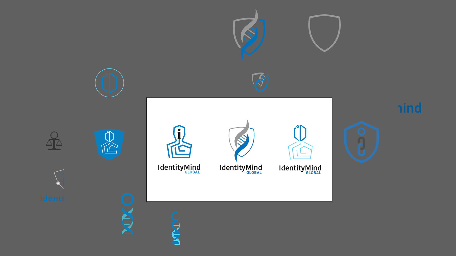
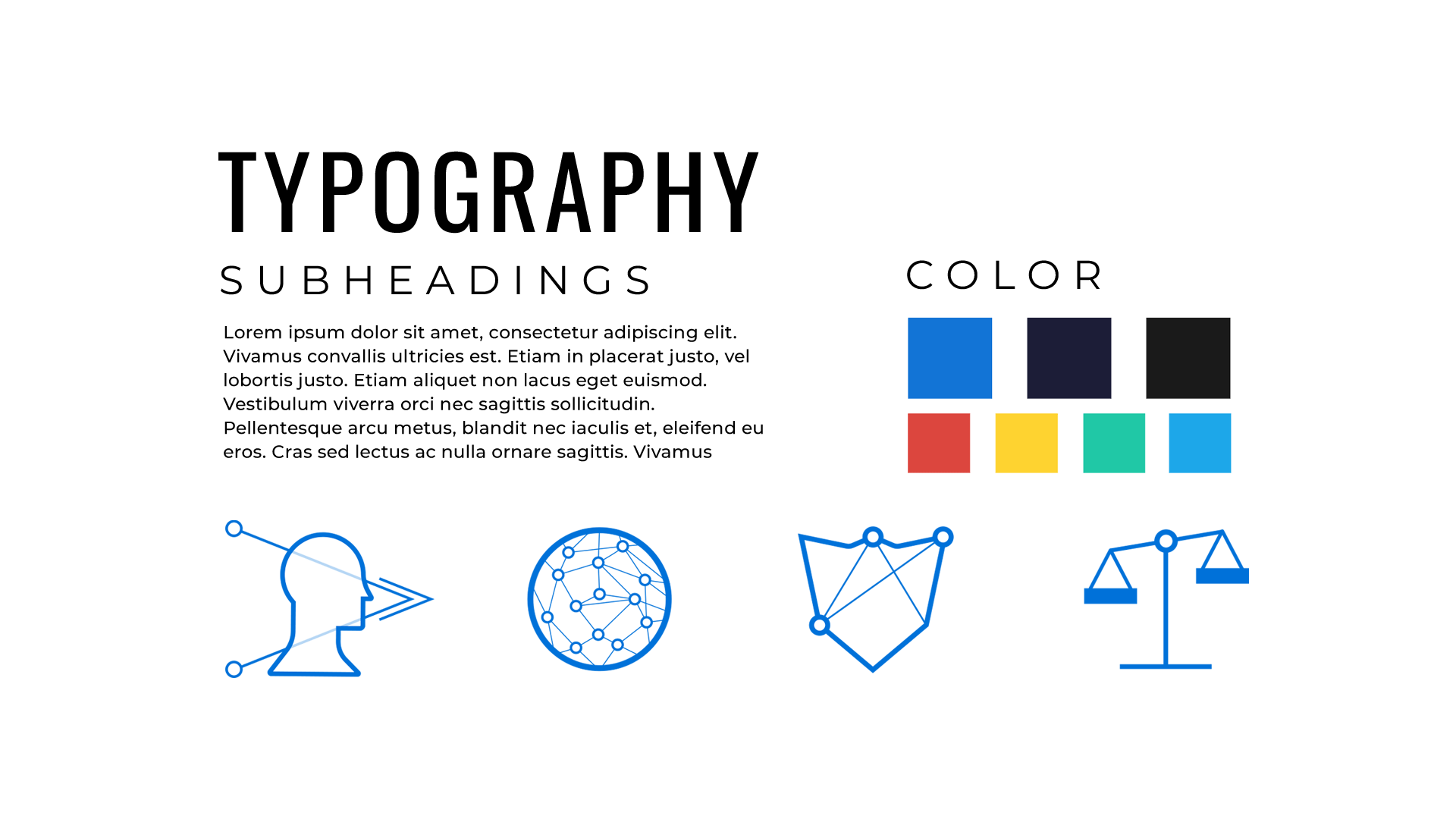
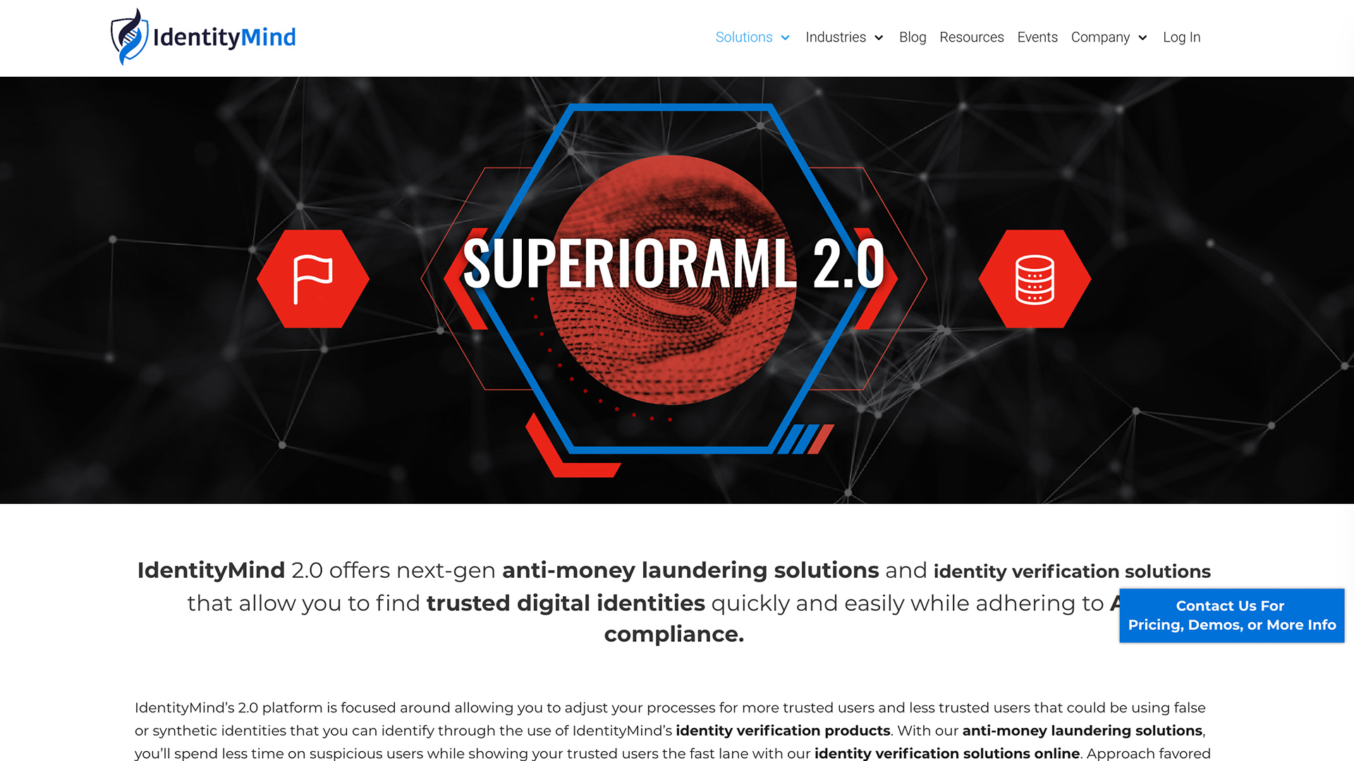
The logo was used as the starting point for the rest of the brand. We focused on making the brand look authoritative, modern, and trustworthy, and developed a full visual language across typography, color, and iconography. To communicate these values, we used saturated, rich blues (which is well-documented to be associated with trust and security), sharp angles, and iconography that was minimal but showed good draftsmanship. We rolled this out through a full website relaunch and revamp of digital and print marketing materials.